
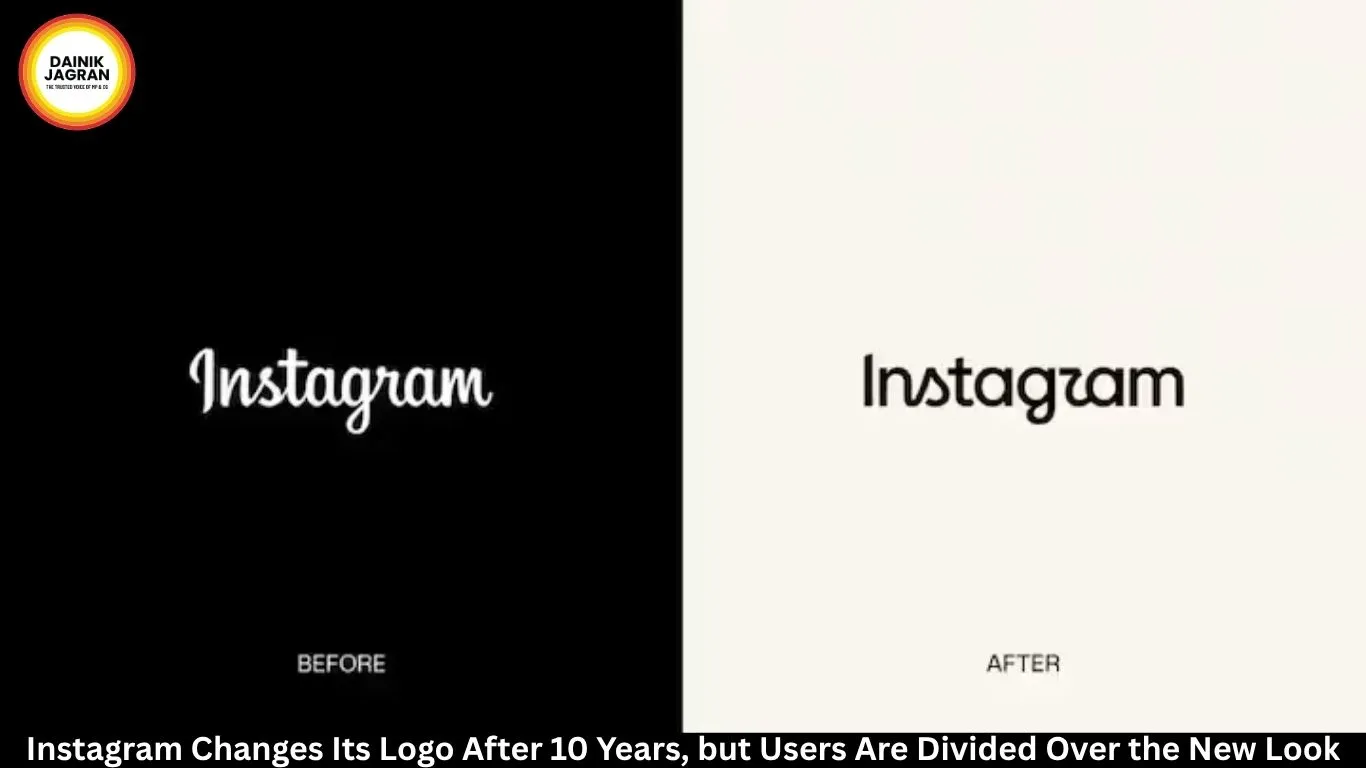
Instagram Changes Logo After 10 Years: New Wordmark Divides Users

Digital desk

Instagram Changes Logo After 10 Years: New Wordmark Divides Users

Instagram has redesigned its wordmark for the first time in 10 years while retaining its iconic gradient camera icon. Here's what's changed and how users are reacting.

Instagram has refreshed a key part of its visual identity for the first time in a decade, introducing a redesigned version of its wordmark while retaining the familiar gradient camera icon. The Meta-owned platform has made subtle changes to the lettering, describing the updated design as cleaner, sharper and more modern.

The redesign was announced by Instagram chief Adam Mosseri through posts on Instagram and Threads. Rather than replacing the platform's established branding, Instagram has redrawn the existing lettering while retaining the script style that users have associated with the service for years.

Mosseri said the wordmark at the top of the app had remained unchanged for 10 years and that the company believed it was time for a refresh.

Also Read... Russia-Linked Accounts Spread Far-Right Narratives Amid Ceuta Crisis: Analysis

A Subtle Branding Change

Unlike a complete logo overhaul, Instagram's latest update focuses mainly on typography.

Also Read... Thailand School Shooting: 14-Year-Old Suspect Learnt Gun Use Through Social Media

The company's recognisable gradient camera icon remains in place, meaning users will continue to see the symbol that has represented Instagram since its major redesign in 2016.

Also Read... ChatGPT Computer History: OpenAI Can Now Remember Your Mac Activity

The new lettering has been adjusted to give it a more contemporary appearance while preserving elements of the original Instagram identity.

The change may appear relatively small, but even minor modifications can attract considerable attention when they involve a globally recognised brand.

Last Major Redesign in 2016

Instagram's previous major visual change came in 2016, when the company replaced its older brown camera illustration with the colourful gradient icon that is now widely associated with the platform.

The earlier logo had closely reflected Instagram's origins as a photo-sharing service. By 2016, however, the platform had already begun expanding beyond simple photography.

The new gradient design initially faced strong criticism from users who considered it too simplistic. Over time, the redesigned icon became a familiar part of Instagram's identity.

Instagram Has Changed Since Then

A decade after the last major visual overhaul, Instagram is very different from the service it was in 2016.

Video has become one of the platform's central features, while direct messaging, shopping, personalised recommendations and algorithm-driven feeds have significantly changed how users interact with the app.

Instagram has increasingly positioned itself as a broader entertainment and content platform rather than simply a photo-sharing service.

Mosseri has previously highlighted recommendations as a major part of the platform's user experience, reflecting this shift in how content is discovered and consumed.

Users React to New Wordmark

The new wordmark has already generated mixed reactions online.

Some users have welcomed the updated lettering and described it as a cleaner version of the familiar branding. Others have questioned why Instagram needed to change a design that was already well recognised.

One of the recurring jokes surrounding the redesign is that the altered lettering can reportedly look like “Instagzam”when viewed quickly.

The reaction illustrates the challenge faced by major technology companies when making changes to familiar branding. Even a minor adjustment to the shape of individual letters can become noticeable to millions of users.

Icon Remains Unchanged

An important difference between the latest update and Instagram's 2016 redesign is the scale of the change.

Instagram has not replaced its familiar gradient camera icon or introduced a completely new visual identity.

Instead, the company has focused on the wordmark that appears alongside its broader branding.

For users, this means the overall Instagram identity remains largely recognisable despite the refreshed lettering.

Why the Change Matters

The redesign comes as Instagram continues to evolve from a photography-focused social network into a platform built around video, creators, recommendations and messaging.

The updated wordmark may therefore be intended to modernise the brand without disconnecting it from its history.

Whether the new design becomes familiar over time remains to be seen. Instagram's 2016 redesign shows that even controversial branding changes can eventually become accepted once users have had enough time to adjust.

For now, however, the new wordmark has left Instagram users divided, with some praising the cleaner look while others remain unconvinced that the decade-old branding needed to be changed.


english.dainikjagranmpcg.com
15 Aug 2026 By Abhishek Joshi

Instagram Changes Logo After 10 Years: New Wordmark Divides Users

Digital desk

Instagram has refreshed a key part of its visual identity for the first time in a decade, introducing a redesigned version of its wordmark while retaining the familiar gradient camera icon. The Meta-owned platform has made subtle changes to the lettering, describing the updated design as cleaner, sharper and more modern.

The redesign was announced by Instagram chief Adam Mosseri through posts on Instagram and Threads. Rather than replacing the platform's established branding, Instagram has redrawn the existing lettering while retaining the script style that users have associated with the service for years.

Mosseri said the wordmark at the top of the app had remained unchanged for 10 years and that the company believed it was time for a refresh.

A Subtle Branding Change

Unlike a complete logo overhaul, Instagram's latest update focuses mainly on typography.

The company's recognisable gradient camera icon remains in place, meaning users will continue to see the symbol that has represented Instagram since its major redesign in 2016.

The new lettering has been adjusted to give it a more contemporary appearance while preserving elements of the original Instagram identity.

The change may appear relatively small, but even minor modifications can attract considerable attention when they involve a globally recognised brand.

Last Major Redesign in 2016

Instagram's previous major visual change came in 2016, when the company replaced its older brown camera illustration with the colourful gradient icon that is now widely associated with the platform.

The earlier logo had closely reflected Instagram's origins as a photo-sharing service. By 2016, however, the platform had already begun expanding beyond simple photography.

The new gradient design initially faced strong criticism from users who considered it too simplistic. Over time, the redesigned icon became a familiar part of Instagram's identity.

Instagram Has Changed Since Then

A decade after the last major visual overhaul, Instagram is very different from the service it was in 2016.

Video has become one of the platform's central features, while direct messaging, shopping, personalised recommendations and algorithm-driven feeds have significantly changed how users interact with the app.

Instagram has increasingly positioned itself as a broader entertainment and content platform rather than simply a photo-sharing service.

Mosseri has previously highlighted recommendations as a major part of the platform's user experience, reflecting this shift in how content is discovered and consumed.

Users React to New Wordmark

The new wordmark has already generated mixed reactions online.

Some users have welcomed the updated lettering and described it as a cleaner version of the familiar branding. Others have questioned why Instagram needed to change a design that was already well recognised.

One of the recurring jokes surrounding the redesign is that the altered lettering can reportedly look like “Instagzam”when viewed quickly.

The reaction illustrates the challenge faced by major technology companies when making changes to familiar branding. Even a minor adjustment to the shape of individual letters can become noticeable to millions of users.

Icon Remains Unchanged

An important difference between the latest update and Instagram's 2016 redesign is the scale of the change.

Instagram has not replaced its familiar gradient camera icon or introduced a completely new visual identity.

Instead, the company has focused on the wordmark that appears alongside its broader branding.

For users, this means the overall Instagram identity remains largely recognisable despite the refreshed lettering.

Why the Change Matters

The redesign comes as Instagram continues to evolve from a photography-focused social network into a platform built around video, creators, recommendations and messaging.

The updated wordmark may therefore be intended to modernise the brand without disconnecting it from its history.

Whether the new design becomes familiar over time remains to be seen. Instagram's 2016 redesign shows that even controversial branding changes can eventually become accepted once users have had enough time to adjust.

For now, however, the new wordmark has left Instagram users divided, with some praising the cleaner look while others remain unconvinced that the decade-old branding needed to be changed.


https://english.dainikjagranmpcg.com/technology/instagram-changes-logo-after-10-years-new-wordmark-divides-users/article-26166

--------

🚨 Beat the News Rush – Join Now!

Get breaking alerts, hot exclusives, and game-changing stories instantly on your phone. No delays, no fluff – just the edge you need. ⚡

Tap to join: 

🟢 WhatsApp Channel: Dainik Jagran MP CG

Crave more?

🅕 Facebook: Dainik Jagran MP CG English

🅧 Twitter (X): Dainik Jagran MP CG

🅘 Instagram: Dainik Jagran MP CG

Share the fire – keep your crew ahead! 🗞️🔥

Trending News